TL;DR: I talk about some text frequency analysis I did on the arxiv.org corpus using python, mysql, and R to identify trends and spot interesting new physics results.
In one of my previous posts, I mentioned some optimization I had done on a word-frequency anlysis tool. I thought I’d say a bit more here about the tool (buzzArxiv), which I’ve put together using Python and R to find articles that are creating a lot of ‘buzz’.
For those who don’t know, arxiv.org is an online repository of scientific papers, categorized by field (experimental particle physics, astrophysics, condensed matter, etc…). Most of the pre-print articles posted to the arxiv eventually also get submitted to journals, but it’s usually on the arxiv that the word about new work gets disseminated in the community. The thing is, there’s just gobs of new material on there every day. The experimental, pheonomonolgy, and theory particle physics mailings can each have a dozen or so articles per day.
TL;DR: I used gource to visualize the ATLAS trigger code development activity in SVN as a way to illustrate the size and the collaborative development environment of the experiment.
It’s hard to convey to a general audience the size and scope of particle physics experiments. Not just the sheer size of the detectors, but the small army of scientists who are all working together. The modern incarnation of particle physics is a highly collaborative effort. The ATLAS masthead, the list of all the authors who get credited on publications, is about three thousand names long and the list of active member, who are affiliated in some way, shape, or form with the experiment, has over fourty-seven hundred entries. This may be small on the scale of big companies (Microsoft has something like ninety thousand employees), but it is absolutely massive on the scale of academic research.
A while ago I cam across gource (http://code.google.com/p/gource/), a tool for “software version control visualization” which renders project activity in many popular repository systems including SVN, which ATLAS uses. It’s rendered output does a good job of representing what I so frequently have trouble conveying about our field. As an example, I pulled the log files for the SVN used by the trigger group (which is one of the areas I’m most involved in), cleaned them up a bit, and passed them to gource. The output below shows the activity in early 2002 when the SVN was started, in 2009 right before collisions were first slated to begin at the LHC, and in late 2012 in the middle of the latest and highest intensity running of the LHC. I scrubbed the video of most identifying information (user names, directory names, etc…), but I think the point still comes across.
Each branch in the video represents a directory, the colored dots are files, and the little icons zooming around are users making commits to the SVN repository. Every time I watch this video I’m struck by how much cross-pollination is going on.
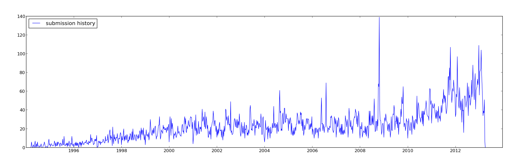
TL;DR: There were some rookie mistakes lurking in some python code which I hunted down with profiling (using cProfile), reducing execution time by an order of magnitude.
This post is a little story about some profiling I did on python code which ultimately revealed that a poor choice of datastructures had a significant impact on code performance. The problem was in some python code which I use to look at trends in physics topics posted to arxiv.org (more on the output of the tool in another post). After pulling the data from arxiv, the script works out word frequency and identifies increased occurences. The parsing of the corpus was taking an excessively long time, my laptop fan would start whirling, and the system would slow to a crawl. Clearly, something very non-optimal was happening.
My first thought was that the issue was in a part of the code that handles the histograming of the occurences, but nothing obvious jumped out at me when I reviewed the code. Enter the python profilers. These things are gret, they’re dead simple to run, and the results are relatively easy to parse. Of the three profilers the python documentation recommends, cProfile is my favorite. Continue reading →
TL;DR: The academic job market is looking bleaker than ever, and name brand recognition counts for a lot.
Step 1: College Student, study hard.
Step 2: Graduate Student, study hard, do research.
Step 3: Postdoc, work hard, more reasearch, prove your chops.
Step 4: Proffesor, kick back and relax, you’re set for life.
Ah, if only.
The postings have begun for this year’s set of junior and tenure track faculty positions. This affects me directly, since I’m somewhere around step 3.5. The truth of the matter, is that the job market for faculty positions is amazingly competitive, with few offerings and a sea of prospective applicants. A while ago, stuck at home while both Laureline and Jenn were sick as dogs, I had a little fun with the information up on the HEP Rumor Mill. The HEP Rumor Mill is exactly what it sounds like, completely unverified rumors about who has been short listed or made an offer high energy particle physics faculty jobs. They’ve got one page per year, going back to the 2004-2005 job cycle. All it requires to get the data is writing quick and dirty unstructured data parser. Ithought I’d share some of what I found. Note that all of what comes out of this is highly suspect. The short-lists and offers are un-verified, the names of candidates are sometimes misspelled, and I even caught one of two instances of someone’s affiliation being improperly reported.